Components
Components are the basic building blocks of Vico.
ShapeComponent
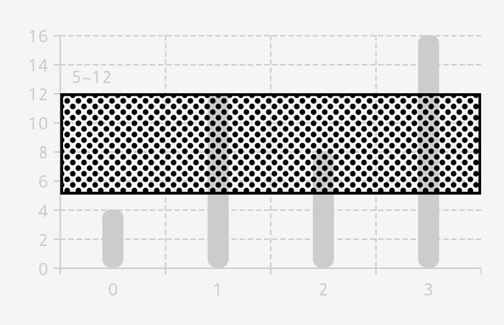
A ShapeComponent draws a Shape, for which you can define a color, a stroke, and more. For Jetpack Compose, a shapeComponent function is available.
ShapeComponent(
    color = Color.BLACK,
    dynamicShader = ComponentShader(ShapeComponent(Shapes.pillShape, Color.DKGRAY), componentSizeDp = 4f),
    strokeWidthDp = 2f,
    strokeColor = Color.BLACK,
)

LineComponent
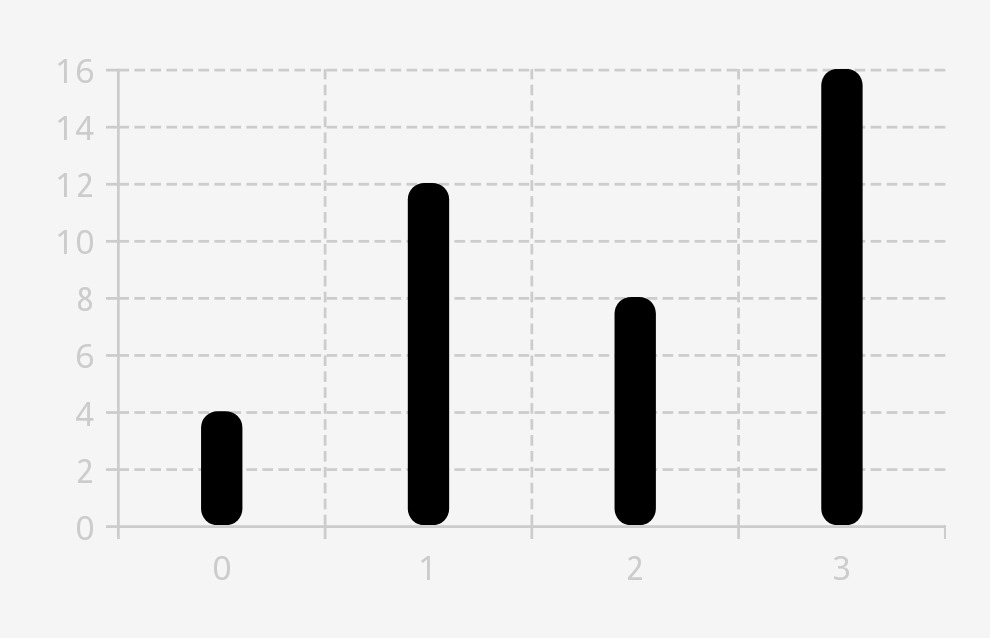
LineComponent extends ShapeComponent. It can draw horizontal and vertical lines, and it is used by Axis, among other classes, to draw axis lines, ticks, and guidelines. For Jetpack Compose, a lineComponent function is available.
LineComponent(
    color = Color.BLACK,
    thicknessDp = 8f,
    shape = Shapes.roundedCornerShape(allPercent = 40),
)

TextComponent
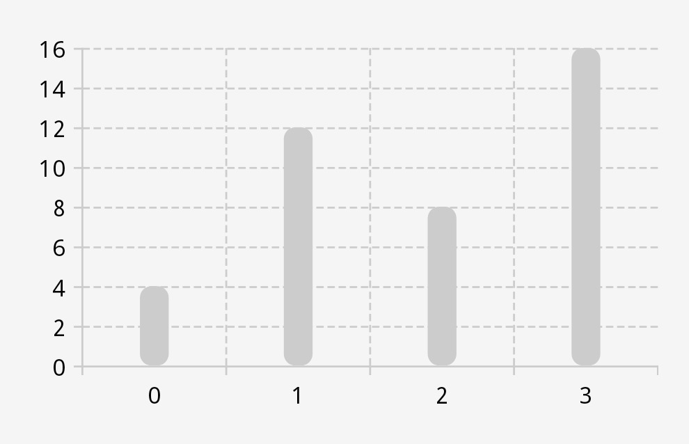
TextComponent draws text. It supports automatic line breaks, text rotation, backgrounds, and more. We recommend creating instances of this class via the textComponent builder and the textComponent composable function.
textComponent {
    color = Color.BLACK
    textSizeSp = 12f
    typeface = Typeface.MONOSPACE
    ellipsize = TextUtils.TruncateAt.END
}

OverlayingComponent
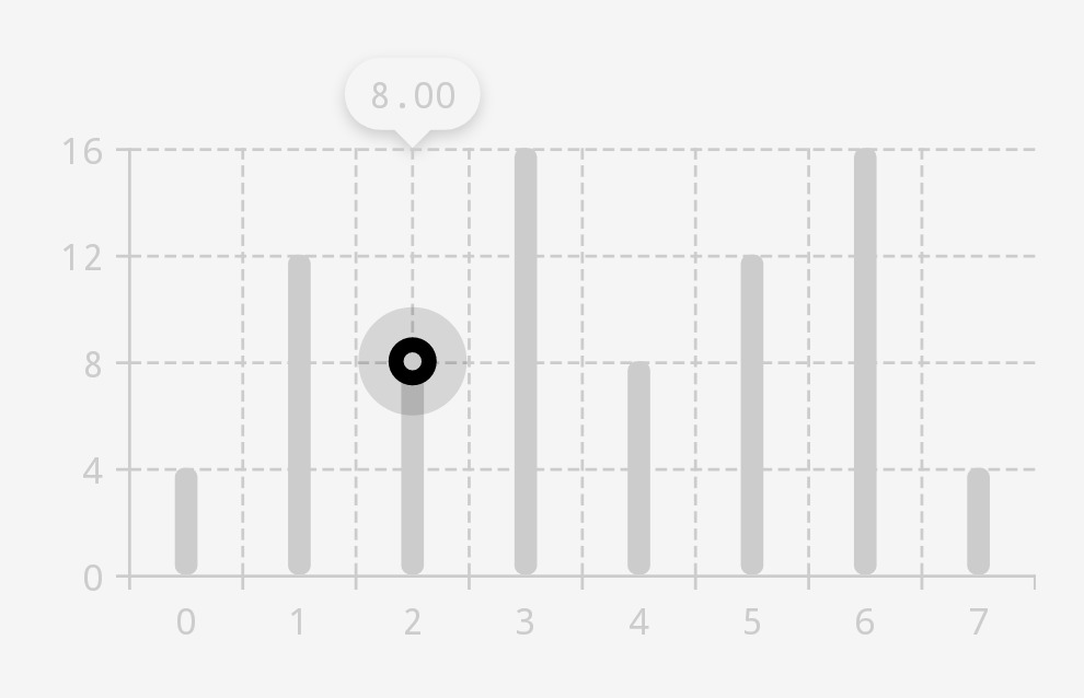
OverlayingComponent overlays two components and allows for specifying the spacing between them. This enables you to create more complex UI elements. For Jetpack Compose, an overlayingComponent function is available.
OverlayingComponent(
    outer = ShapeComponent(Shapes.pillShape, Color.BLACK.copyColor(alpha = .32f)),
    innerPaddingAllDp = 10f,
    inner = OverlayingComponent(
        outer = ShapeComponent(Shapes.pillShape, Color.BLACK),
        inner = ShapeComponent(Shapes.pillShape, Color.LTGRAY),
        innerPaddingAllDp = 5f,
    ),
)
